
Identity • Design Systems
Entering a new age of work, Indeed journeyed into a full refresh to better help job seekers and employers.
Working in-house, I had the honor of being part of the small but mighty team that succesfully redesigned Indeed’s brand identity. Known as Brand Systems, our team developed audits, prototypes, guidance, and ultimately distributed assets. I took lead on iconography, illustrations, and motion, while also contributing support to our other brand assets like color and typography. When it was all said and done, we enabled Indeed’s first ever company-wide mandate to move all product experiences into this new identity.
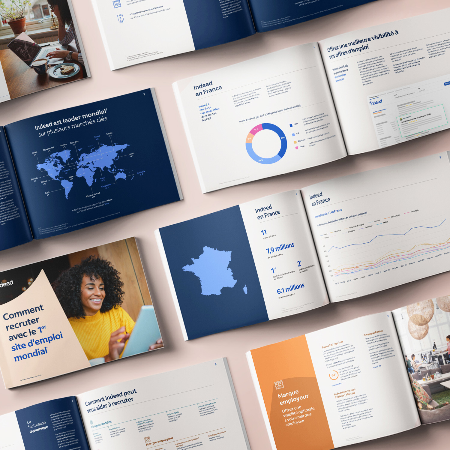
Brand Range
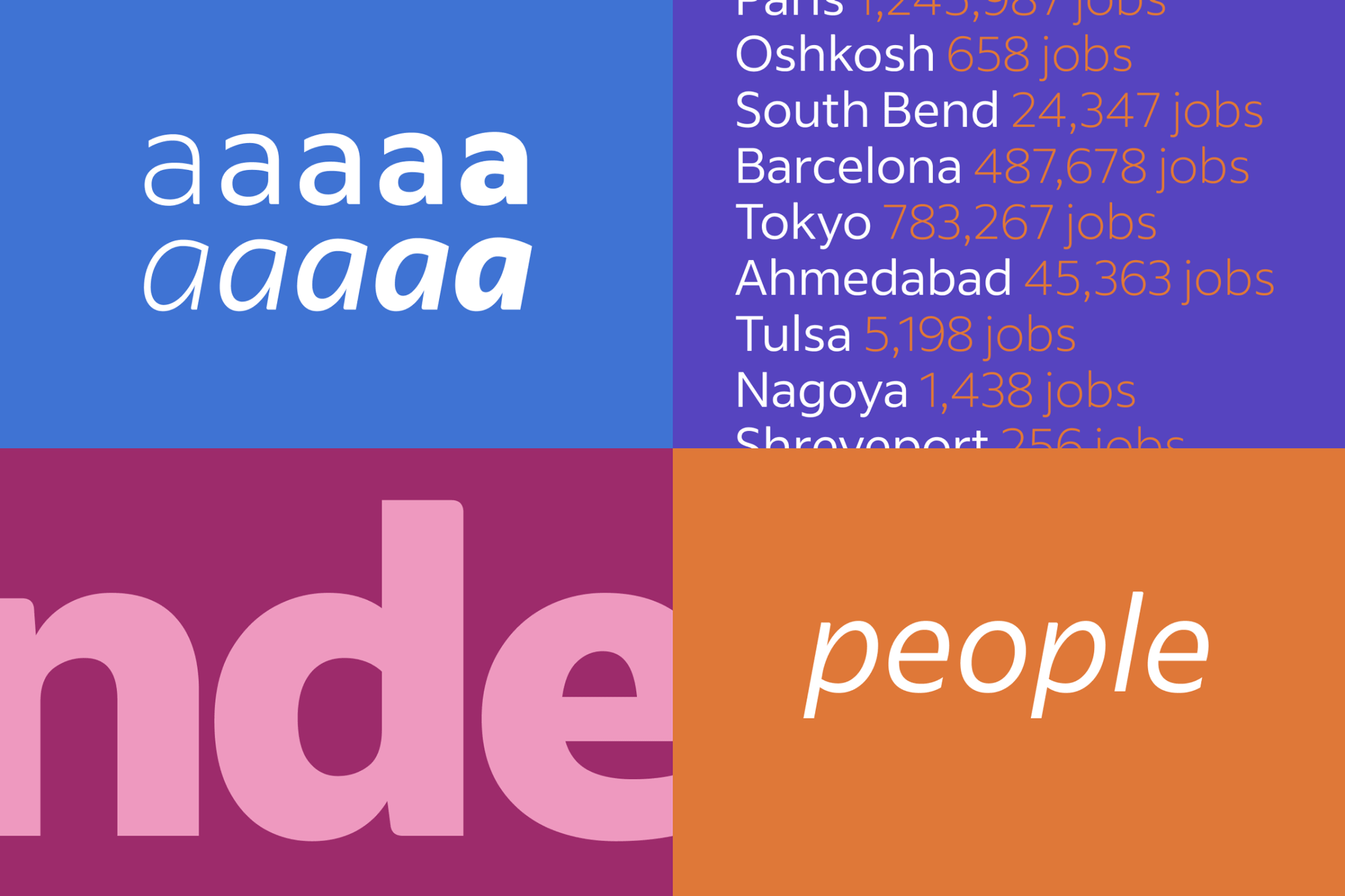
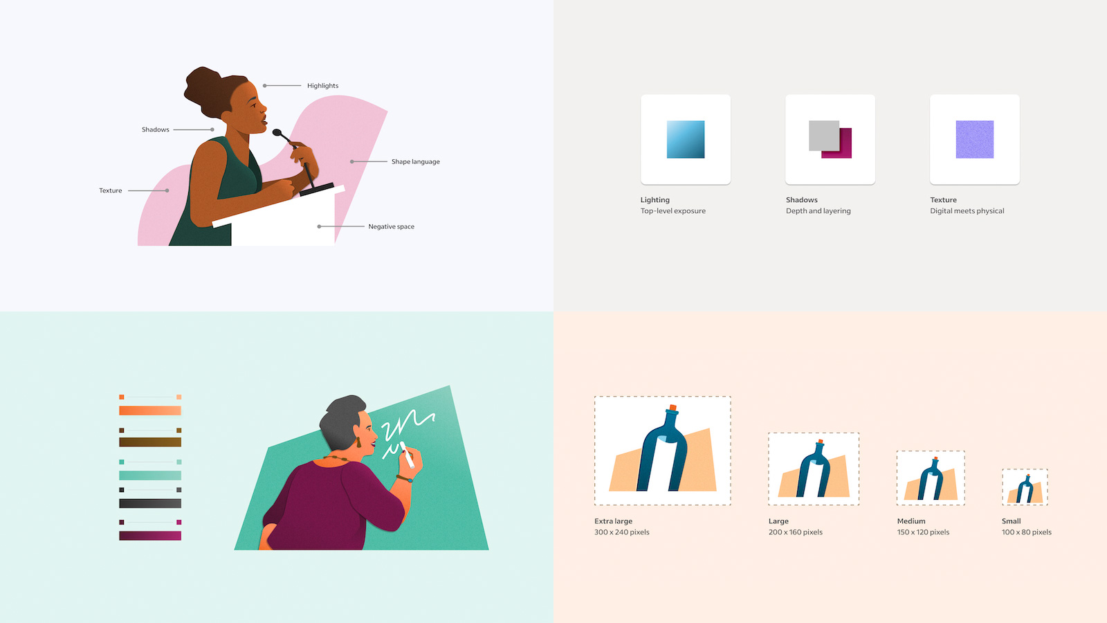
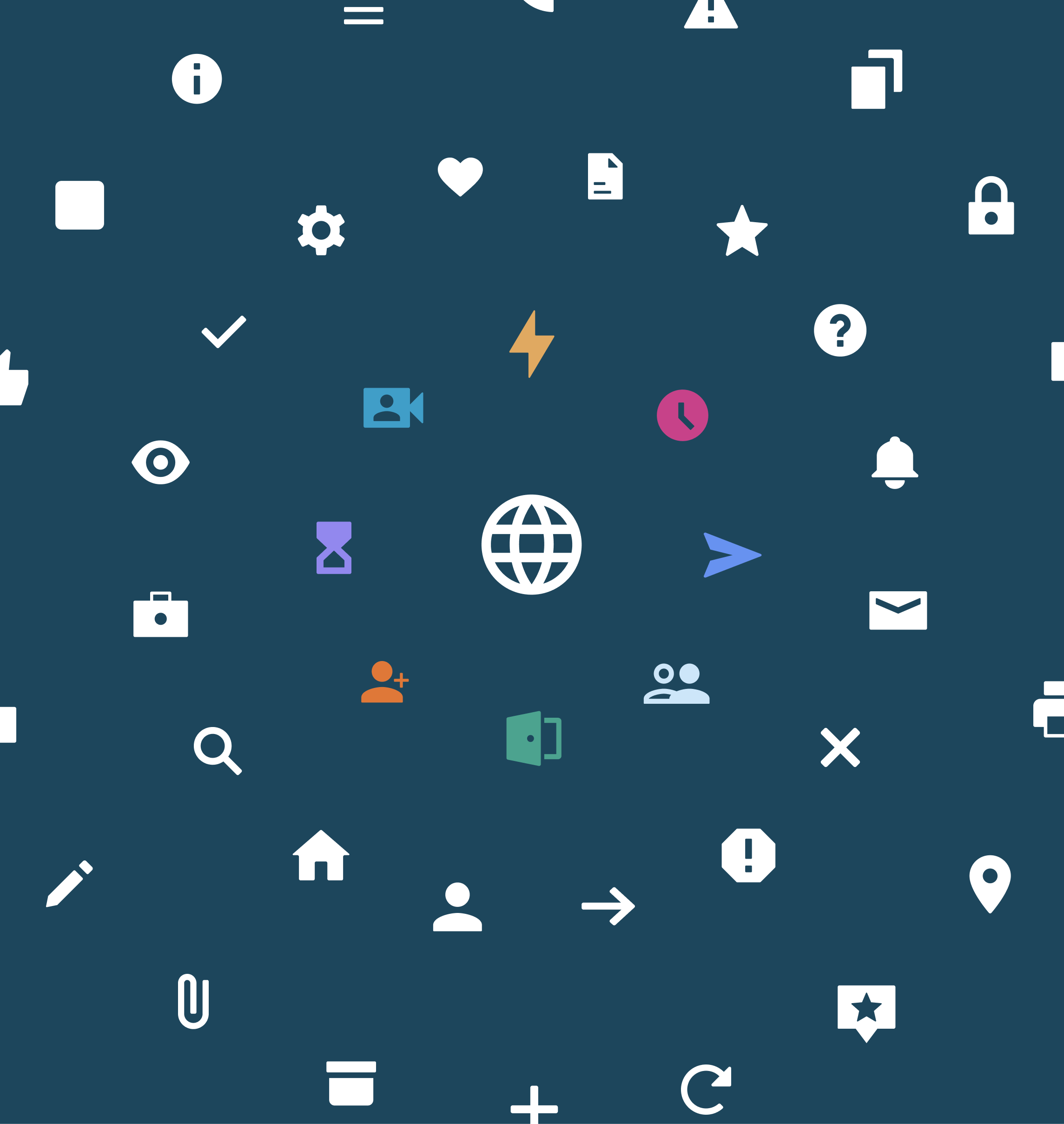
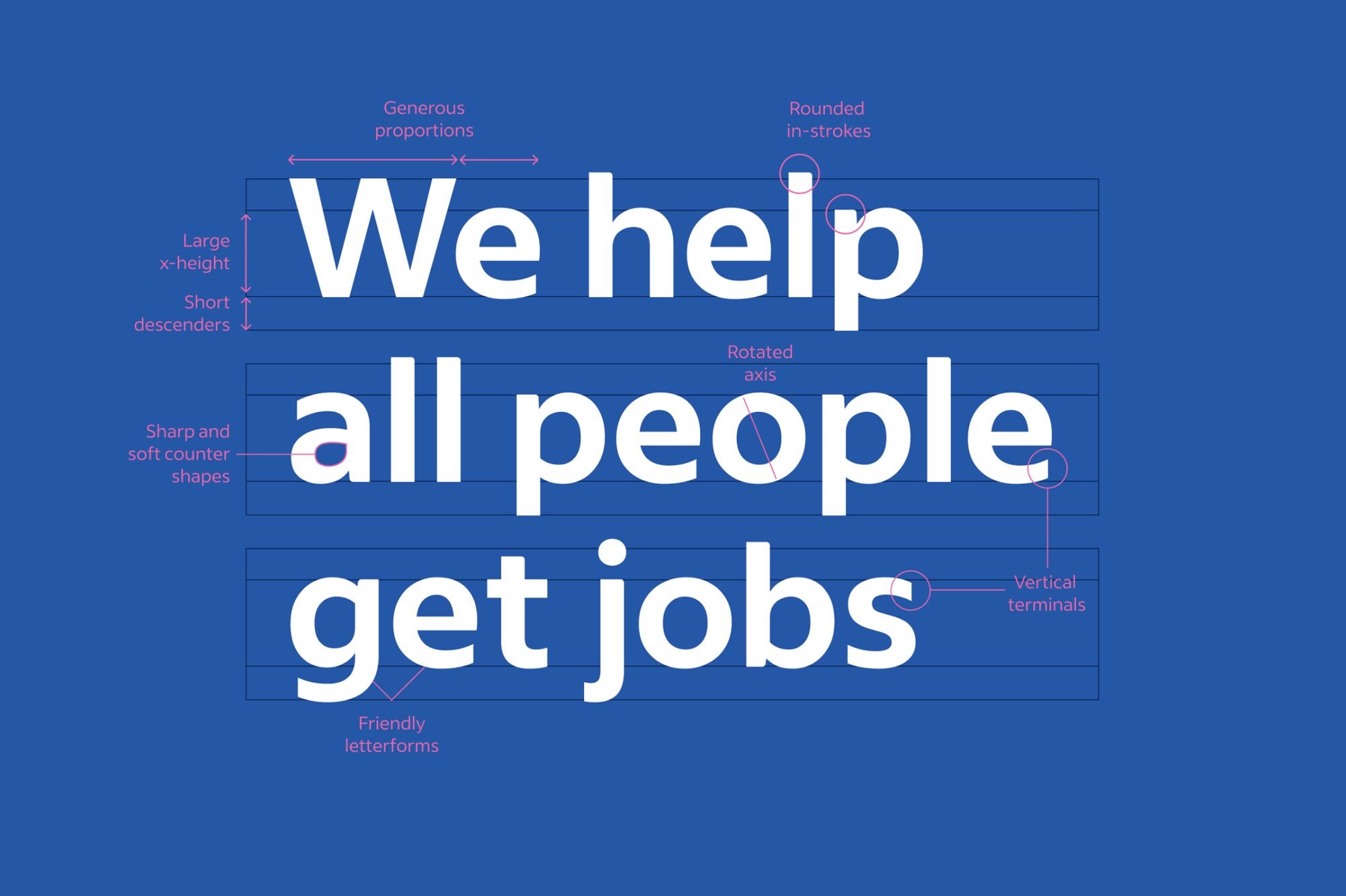
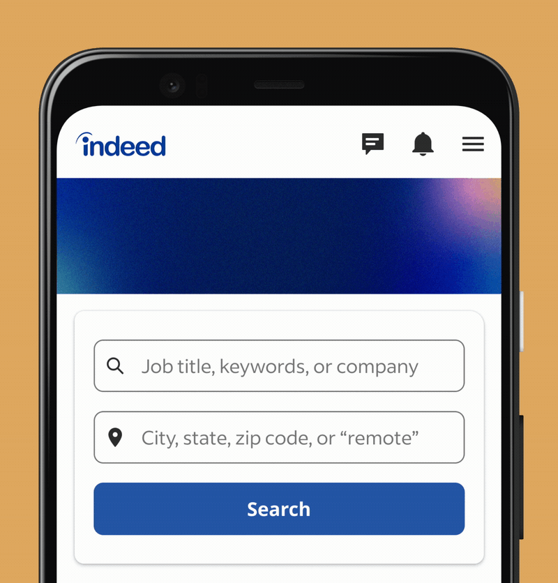
The identity work updated everything except the logo (womp). As should be the case will all brands, accessibility was a forefront objective in our discovery. We overturned misleading metrics from hot colored buttons and prioritized humanizing the job discovery experience through bolder use of illustrations and photography. As most tech companies were prone to the “blue people” approach, we we went all in to show off what a more intentional design could really feel like. We also developed a custom typeface to enhance the brand presence and enable a more graphical use of content. Icons were systemized adn took on a more functional role. Motion was treated as a supportive element and from that foundation I built cohesive guidance.
The identity work updated everything except the logo (womp). As should be the case will all brands, accessibility was a forefront objective in our discovery. We overturned misleading metrics from hot colored buttons and prioritized humanizing the job discovery experience through bolder use of illustrations and photography. As most tech companies were prone to the “blue people” approach, we we went all in to show off what a more intentional design could really feel like. We also developed a custom typeface to enhance the brand presence and enable a more graphical use of content. Icons were systemized adn took on a more functional role. Motion was treated as a supportive element and from that foundation I built cohesive guidance.


Motion for Indeed
Outside of the most basic interaction states, Indeed lacked clear direciton on why, how, when, and where motion mattered within their product space. To garner user trust while maintaining accessiblity, I developed a foundational system that enabled support throughout the entire job seeker and employer journey.
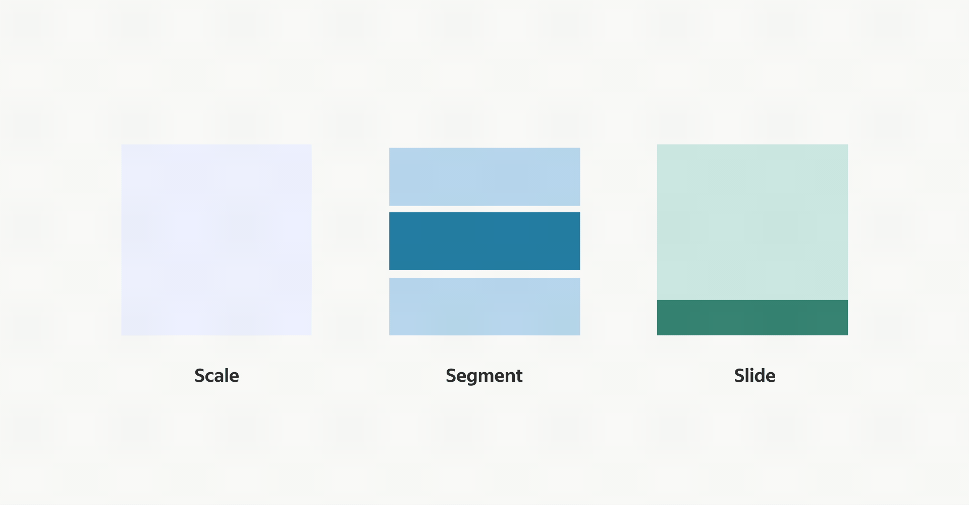
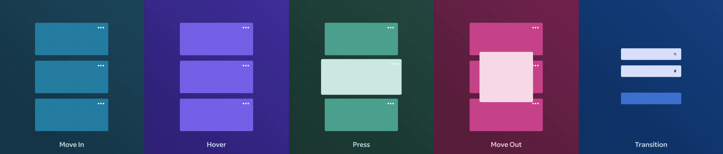
After looking through a large part of the product space, I created core motion states that could estabilish support for any of Indeed’s needs.
- Scale: enables focus and draws awareness to a useful feature
- Segment: helps to reveal or remove in order to create space for information
- Slide: educates by demonstrating spatial awareness to users
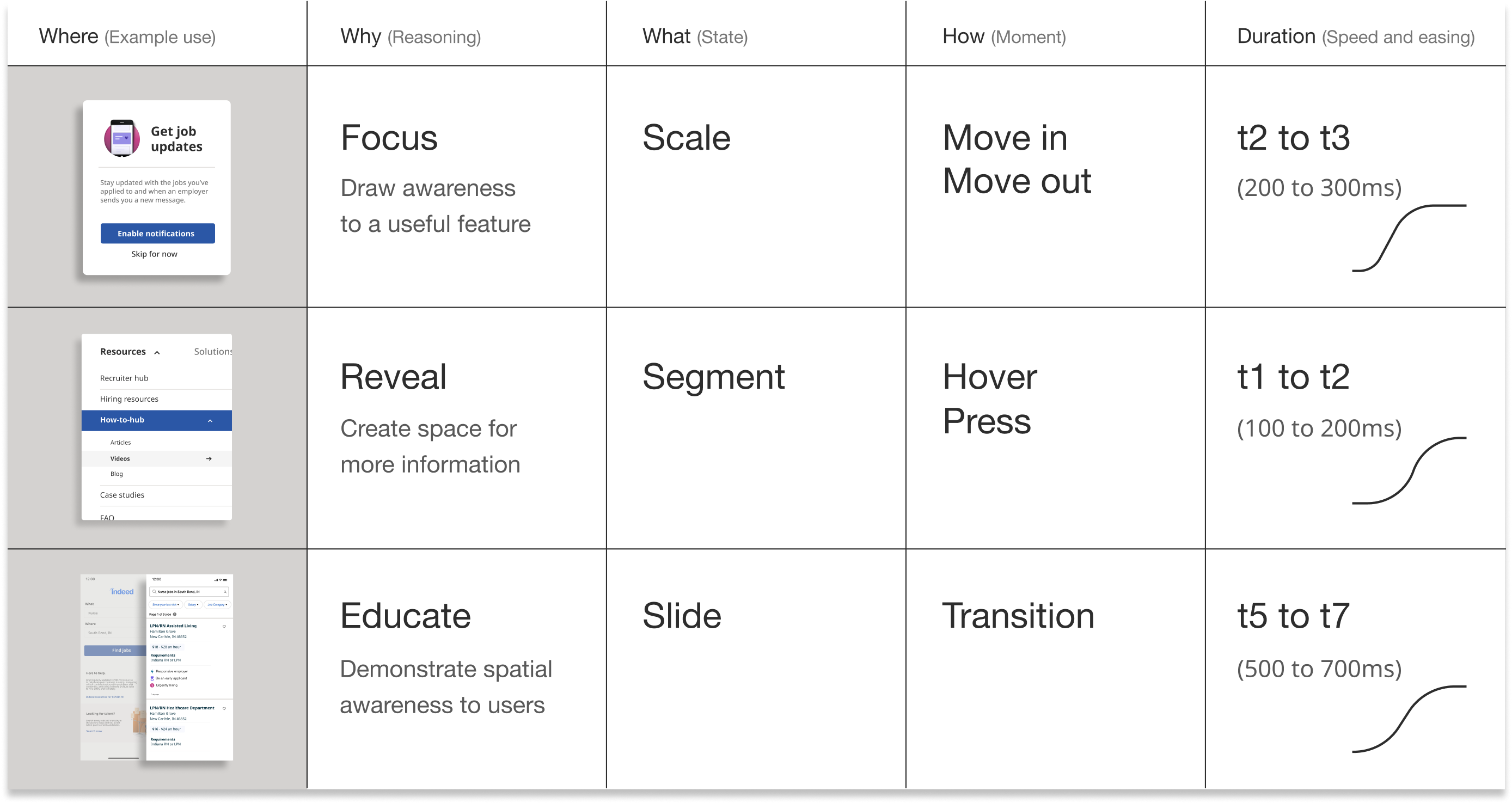
Using those core states, teams could begin to identify their moment for motion. These five moments cover the most supportive needs. They may appear obvious, but that’s because they aren’t supposed to be overly complex. They allow for a way to establish a structure of what needs motion and how it gets it.
To demonstrate real usage, I developed an example starter sheet so teams could quickly figure out their page formula and begin proposing motion within their prototypes. As stakeholders began asking for validation, designers and engineers could quickly show proof behind their decisions.
To demonstrate real usage, I developed an example starter sheet so teams could quickly figure out their page formula and begin proposing motion within their prototypes. As stakeholders began asking for validation, designers and engineers could quickly show proof behind their decisions.
Motion Guidance
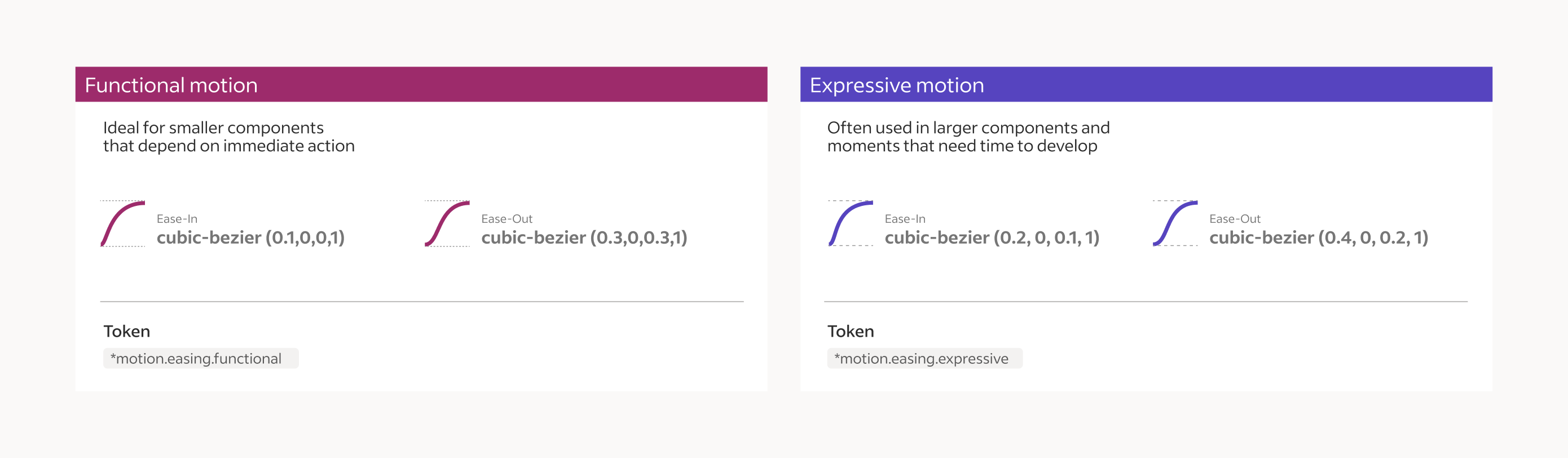
Choreography and timing played a critical role in how components and features presented themselves. It was important to establish both functional and expressive moments to ensure the motion felt right and could easily be scanned. This also included a common axis for directional motion and layer depth.
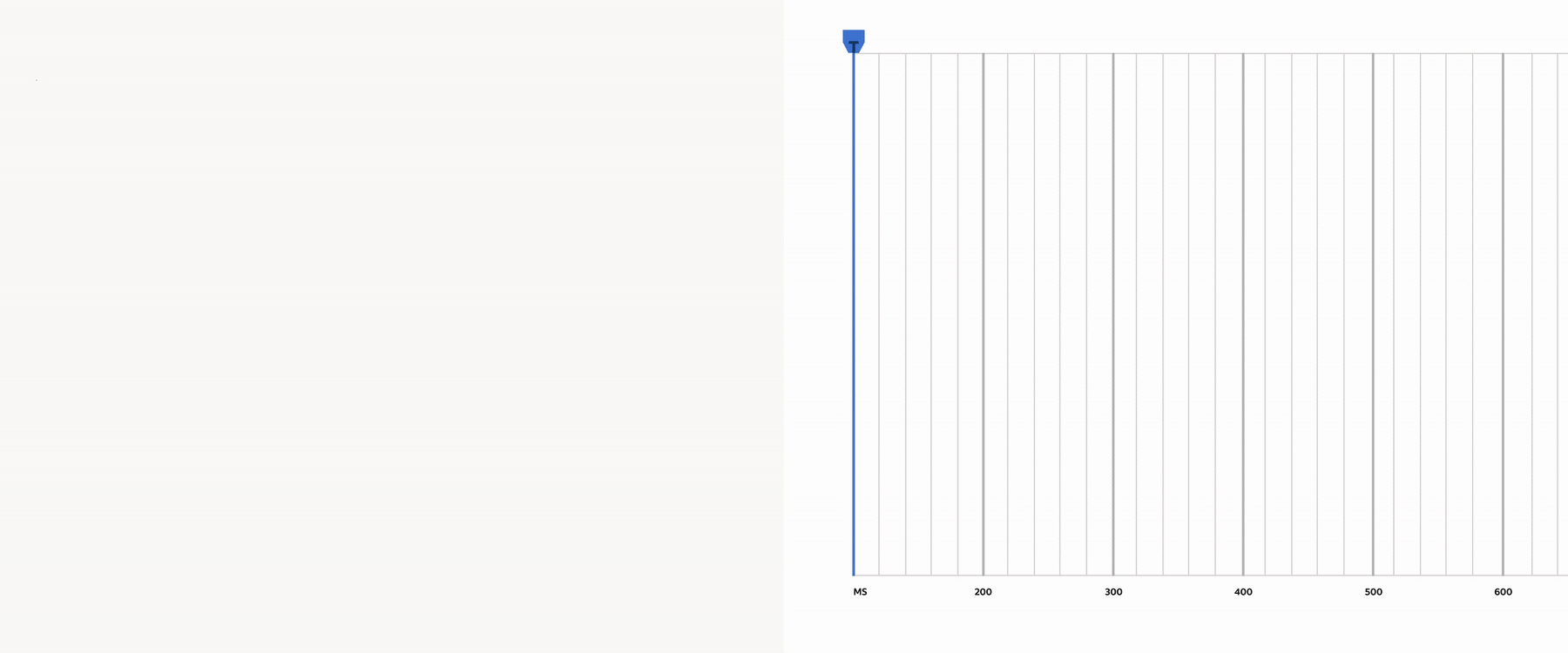
Choreographed moments were designed with a range of easing and duration properties.

Motion in Product


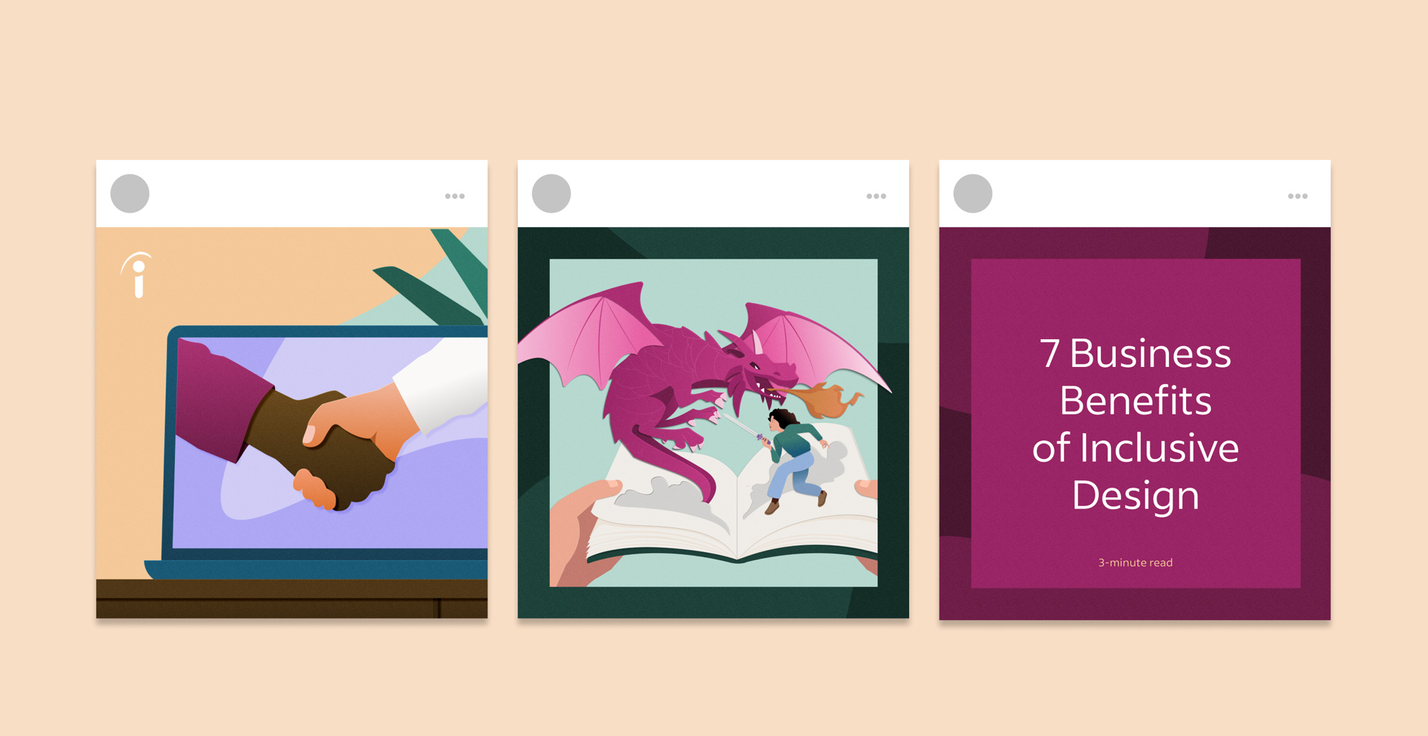
Indeed.Design
We also built a website dedictated to this work. See more of it here at indeed.design.
I contributed a few articles as well:
I contributed a few articles as well:
